Poster Design—Design Process
INTRODUCTION
The project was to make a poster of (line drawing portrait that is cartoonish in style and that exaggerates your head size and key facial features) that represents myself based on my photo using the application Adobe Illustrator Draw on the Apple Ipad.
MATERIALS:
Adobe Illustrator CC
Adobe PDF
Creative Cloud
Behance
CREATIVE PROCESS:
So the idea I came up with is to make a poster for a film photography workshop. I decided to draw a camera using the illustrator through a research that I did of what camera to draw. I also added some films for some design on the background, so it doesn't look that plain.
CONCLUSION:
In conclusion, I am quite satisfied with what I made. It was hard for me to decide on the type font but I managed to come up with the one I used that looks like retro in a way. If I were to do it again, I would try drawing a variety of film cameras and portray it as a pattern.
PRODUCTION METHODS/WORKFLOW and TOOLS:
Step 1: Background - I decided for a black background for my poster.
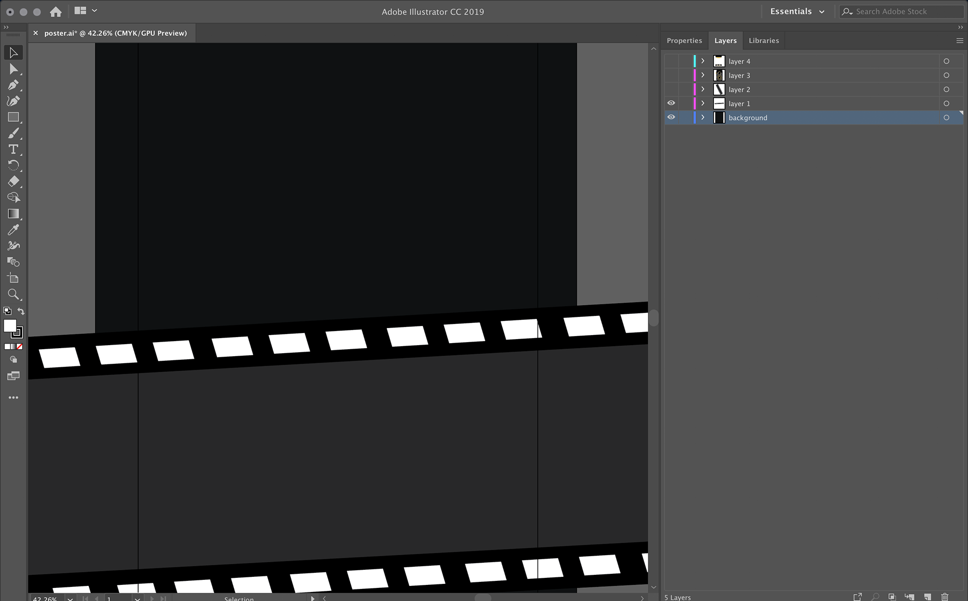
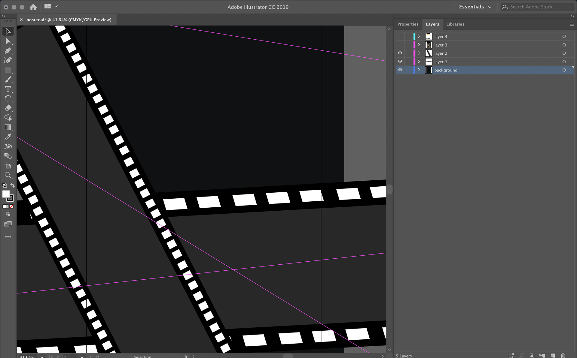
Step 2: I decided to put film like objects that I made myself to add details.
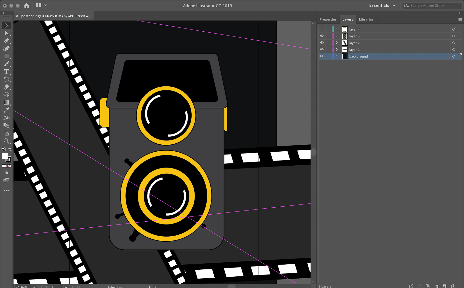
Step 3: I created a camera based on a Lubitel 166 camera, and decided for a golden yellow colour for the details, and dark colour for the camera body itself. I also played with it with different colours, but it didn't look right, so I ended up using these colours.
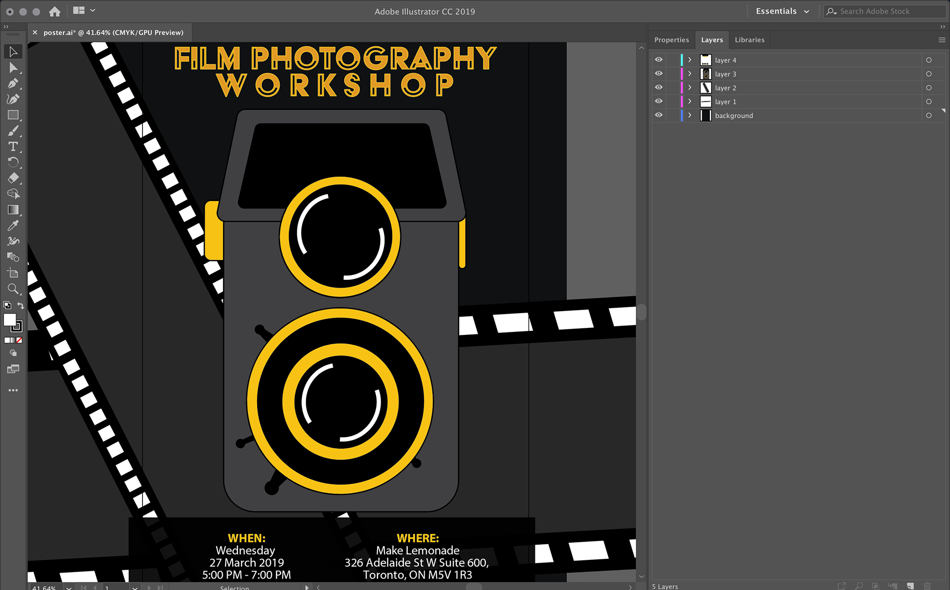
Step 4: I played with the type fonts and looked for something vintage or retro, so I ended up using this type font for the workshop. For the details, I used a simple one so it would look like a real poster and is readable. I maintained using golden yellow colour for it too, to make it balanced.
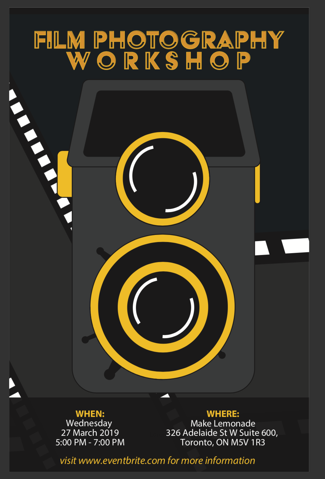
Step 5: Check if everything is good.